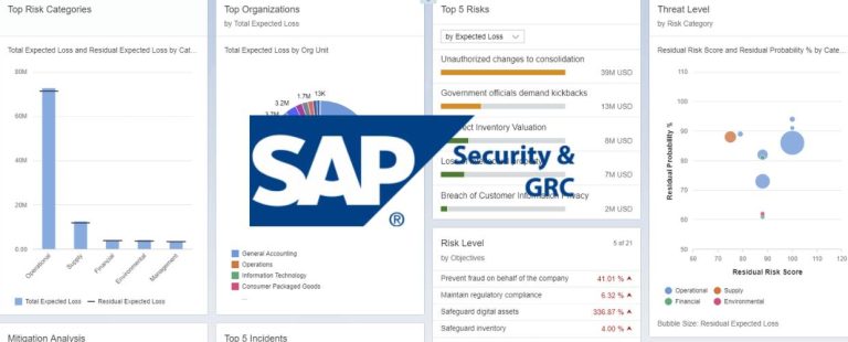
In the era of big data, data visualization design stands as a dynamic blend of creativity and analytical prowess. Its purpose is to transmute intricate datasets into visual representations that are easy to comprehend and possess the power to enlighten and inform. Today’s Organizations lean heavily on data visualization to unlock invaluable insights, make decisions grounded in data, and convey data-driven narratives compellingly. This comprehensive article delves into the pivotal significance of data visualization design, elucidates the fundamental principles underlying effective methods, and expounds upon its transformative impact in converting data into actionable intelligence.
The Significance of Data Visualization Design
Data visualization design is an indispensable facet of data analysis and communication. The following aspects underscore the profound significance of data visualization design.
Clarity and Understanding
In a world inundated with data, distilling complex information into precise, accessible visual forms is a powerful asset. Data visualization design simplifies intricate datasets, rendering them understandable to a broader audience and augmenting data interpretation. Data is abundant in today’s information-driven landscape, but its value is only unlocked when understood. Data visualization design acts as a bridge between raw data and human comprehension. Complex datasets are simplified by transforming data into intuitive visual representations—such as charts, graphs, and infographics—allowing data experts and non-experts to grasp critical insights at a glance. Whether presenting financial trends, market analysis, or scientific research, data visualization design empowers organizations to communicate information clearly, facilitating better decision-making and a deeper understanding of the underlying data.
Insight Discovery
Beyond its aesthetic appeal, effective data visualization design is a potent tool for insight discovery. It unveils patterns, trends, and correlations that may lay concealed in raw data, empowering decision-makers to glean actionable insights and make well-informed choices. Data holds a wealth of untapped insights, often hidden beneath layers of complexity. Data visualization design acts as a spotlight, illuminating the hidden gems within the data. By transforming numbers into visual elements, trends, and anomalies become apparent, enabling organizations to identify opportunities, pinpoint challenges, and optimize strategies. For instance, a well-designed line graph might reveal a correlation between marketing expenditures and revenue growth, leading to informed resource allocation. In this manner, data visualization design transforms data from a sea of numbers into a treasure trove of actionable intelligence, driving business strategies that are both evidence-based and forward-thinking.
Storytelling
Data visualization design assumes the role of a storyteller, transforming raw data into a visual narrative. It enables stakeholders to grasp the significance of the data and its implications for business outcomes, fostering a deeper level of engagement. Humans are inherently drawn to narratives, and data visualization design leverages this natural inclination to create compelling stories from data. Just as a captivating story has a beginning, middle, and end, data visualizations follow a similar structure. Data points become characters, trends become plotlines, and insights become the climax. This narrative approach engages viewers emotionally, making data relatable and memorable. Consider an interactive map that visualizes the spread of a global pandemic—the rising and falling curves become chapters, the countries affected become characters, and the data points become milestones in the storyline. This narrative-driven design imparts information and sparks curiosity, igniting a desire to explore and understand the data’s entire narrative.
Visual Appeal
Aesthetics matter. Well-designed data visualizations can captivate viewers, making data engaging and memorable in memory. By amalgamating data with artistic elements, designers create visual experiences that resonate. Visual appeal is more than just eye candy; it’s a strategic element that enhances data retention and impact. When data visualizations are aesthetically pleasing, viewers are more likely to pay attention, absorb information, and remember critical takeaways. Design choices, such as color palettes, typography, and layout, influence how viewers perceive and interact with the data. An elegantly designed infographic, for instance, transforms data into a work of art that captures attention and invites exploration. By strategically incorporating visual elements that align with the data’s narrative, designers elevate the overall experience, ensuring that the information presented remains etched in the viewer’s memory.
Fundamental Principles of Data Visualization Design
When designing data visualizations, it’s essential to remember the basic principles of design. These principles include things like simplicity, clarity, and effectiveness.
Know Your Audience
The foundation of effective data visualization lies in understanding the audience. Tailor visualizations to resonate with the intended viewers by considering their background, familiarity with data, and specific needs. Effective communication begins with knowing your audience. Before embarking on the design process, it’s essential to identify who will engage with the data visualizations and their needs. For a technical audience, such as data scientists or analysts, visualizations can delve into intricate details and complex metrics. However, for non-technical stakeholders, simplicity and clarity take precedence. Designers must consider the level of data literacy among viewers and adjust the complexity of the visualizations accordingly. By tailoring the design to the audience’s expertise, data visualization becomes an inclusive tool that empowers diverse stakeholders to participate in data-driven discussions and decision-making.
Simplicity and Clarity
Simplicity is the cornerstone of effective design. Embrace a minimalist approach, eschewing clutter and extraneous elements to maintain a clear and focused message. The adage “less is more” holds in data visualization design. Extraneous details and unnecessary embellishments can obscure the data’s message, leading to confusion and misinterpretation. A well-designed visualization distills complex information to its essence, highlighting the most pertinent insights without overwhelming the viewer. This principle extends to the choice of chart types and the arrangement of data points. For instance, a bar chart with clearly labeled axes and minimal gridlines conveys information more effectively than a cluttered and convoluted 3D chart. By prioritizing simplicity and clarity, designers ensure that the data’s core message remains front and center, enabling viewers to grasp insights swiftly and accurately.
Relevance and Context
Context is critical to comprehension. Provide meaningful context and relevant labels to guide viewers in understanding the data’s significance and implications. Data visualizations are most impactful when they offer context that frames the data’s relevance. Labels, titles, and annotations are crucial in guiding viewers through the visualization and helping them interpret the data accurately. For example, a scatter plot illustrating the correlation between temperature and ice cream sales should include labels that indicate the period, units of measurement, and any influencing factors. By providing this contextual information, viewers can make informed connections between data points and conclude with confidence. Furthermore, designers can enhance context by incorporating annotations highlighting key events, trends, or milestones, enriching the narrative and deepening understanding.
Appropriate Visual Representations
Selecting the right chart type or graph is paramount. Bar charts, line graphs, pie charts, and heatmaps, among others, serve as the language through which data speaks. Choose the representation that best aligns with the data’s narrative. Selecting the appropriate visual representation is akin to choosing the right words for a story. Each chart type has its strengths and limitations, and the choice should align with the nature of the data and the insights you wish to convey. Line graphs are ideal for illustrating trends over time, while bar charts excel at comparing quantities across categories. Pie charts can effectively showcase proportions, and scatter plots unveil relationships between variables. The choice of representation impacts the initial impression and the ease of interpretation. An organization seeking to showcase market share among competitors might opt for a stacked bar chart, whereas a news outlet reporting daily COVID-19 cases might rely on a line graph to depict the progression of the pandemic. By selecting the most suitable visualization, designers amplify the data’s communicative power and ensure the message is conveyed accurately.
Color and Contrast
Colors wield immense power in guiding attention and highlighting insights. Utilize color purposefully to accentuate critical points and employ contrast to differentiate data points effectively. Colors are more than mere aesthetics—they are a strategic tool in data visualization design. When used purposefully, colors can draw attention to specific data points, emphasize trends, and convey meaning. For example, a red bar in a bar chart might indicate negative growth, while a green bar represents positive growth. Additionally, color contrast enhances readability and ensures that data points are distinguishable. Dark colors against a light background and vice versa enhance visibility, particularly for viewers with different color perceptions. However, exercising restraint and avoiding overwhelming visualizations with a cacophony of colors is essential. A judicious use of a limited color palette maintains visual harmony while directing the viewer’s focus to the most salient information.
Consistency and Uniformity
Visual coherence is achieved through consistency. Maintain uniformity in font styles, color schemes, and scales across visualizations, facilitating a seamless and harmonious visual experience. Consistency is the glue that binds a series of visualizations into a cohesive narrative. Maintaining consistent design language ensures that viewers seamlessly transition between different visual elements when designing multiple visualizations for the same dataset or presentation. Features such as font styles, color schemes, and scales should remain uniform to create a sense of visual harmony. For instance, if a blue color represents a specific category in one chart, the same color should mean the same category in all subsequent charts. This uniformity not only enhances the aesthetics of the visualizations but also reduces the cognitive load on the viewer, allowing them to focus on interpreting the data rather than deciphering design discrepancies.
Transformative Impact of Data Visualization Design
Data visualization design can have a transformative impact on the way people understand and interpret data. By highlighting essential insights and presenting them clearly and engagingly, designers can help decision-makers make informed choices and drive positive change.
Data-Driven Decision-Making
Well-designed data visualizations expedite data analysis, enabling timely and informed decision-making. Data visualization design catalyzes data-driven choices by presenting information in a visually digestible format. Data-driven decision-making is the bedrock of effective business strategies, and data visualization design is pivotal in this process. Designers facilitate quicker data analysis and interpretation by transforming complex datasets into intuitive visual forms. Decision-makers can quickly identify trends, outliers, and correlations, enabling them to make informed choices on time. Consider a sales dashboard that visualizes monthly revenue, sales targets, and customer acquisition rates. With a glance, executives can assess performance against targets, spot areas requiring attention, and adjust strategies accordingly. The accessibility of visual data empowers decision-makers to respond to changing market conditions and emerging opportunities promptly, ensuring that the organization remains agile and competitive.
Effective Communication
Data visualization design bridges the gap between data experts and non-experts, engendering better communication and collaboration. Complex data is transformed into an accessible language that fosters meaningful dialogue. Effective communication is essential for aligning stakeholders, sharing insights, and driving collective understanding. However, data can often be daunting for non-experts, leading to miscommunication and misinterpretation. Data visualization design acts as a universal language that transcends technical barriers. Whether presenting financial reports to board members or conveying research findings to a diverse audience, visualizations simplify complex concepts and facilitate clear communication. For example, a healthcare organization could use data visualizations to communicate vaccination rates, disease trends, and demographic patterns to medical professionals and the general public. The visual representations serve as a bridge, enabling data experts and non-experts to engage in informed discussions, collaborate effectively, and work towards shared goals.
Engaging Presentations
In presentations, data visualizations serve as compelling focal points. They distill complexity, making data accessible and memorable for the audience and enhancing the impact of presentations. Presentations are opportunities to convey information, inspire action, and leave a lasting impression. Data visualizations elevate presentations from mundane slideshows to captivating narratives. A well-designed data visualization captures the audience’s attention, sparking curiosity and encouraging active engagement. Whether it’s a quarterly business review or a scientific conference, visualizations transform data from abstract concepts into tangible insights that resonate with the audience. For instance, an interactive map displaying global population distribution can captivate viewers and prompt discussions on urbanization, migration, and demographic trends. By leveraging the power of data visualization design, presenters create memorable experiences that leave a lasting impact, ensuring that the information presented remains imprinted in the audience’s minds.
Enhanced Data Storytelling
Data visualization design endows data with a captivating narrative, rendering it more persuasive to stakeholders. Data acquires depth and resonance through visual storytelling, making it a potent tool for influencing decisions. Storytelling is a timeless art; data visualization design harnesses its potency to convey narratives through data. Designers create a narrative arc that captures attention and sustains interest by weaving data points into a coherent storyline. Consider a data visualization depicting climate change’s impact on global temperatures. Through animated visualizations, viewers can witness the gradual temperature rise over the years, effectively telling the story of environmental transformation. This visual narrative educates and evokes emotions, fostering a deeper connection with the data and its implications. Stakeholders, from investors to policymakers, are more likely to be persuaded by a compelling data-driven story that resonates with their values and priorities.
Conclusion
Data visualization design is an alchemical process that transcends mere numbers and statistics. It metamorphoses raw data into a meaningful and actionable form of intelligence. Guided by the bedrock principles outlined above, data visualization designers craft visual narratives that resonate with diverse audiences, rendering complex data accessible, engaging, and impactful.
As organizations increasingly recognize the pivotal role of data in their operations, data visualization design emerges as a linchpin for transforming data into visual stories that catalyze innovation, inform strategies, and pave the path to success in today’s rapidly evolving information landscape. Integrating data visualization design into the core of data analysis and communication yields a lucid, insightful comprehension of data, propelling organizational growth and unleashing the boundless potential of data-driven intelligence.
